Introducing color
Color is a powerful tool in garden design, influencing our senses and the way in which we respond to the environment around us. Colors can also convey an atmosphere, mood, or message: warm, vibrant colors generate a feeling of immediacy, liveliness, and excitement, while cool colors create a calm, spacious, often tranquil atmosphere.COLOR WHEEL
The language of color is best understood using a color wheel—a device employed by many artists and designers to explore the visual relationships between colors and the effects different ones can create when placed together. In particular, it helps us to see why some combinations work better than others, and why one color can dramatically influence another to produce a startling contrast or confer a harmonious continuity.HUES, TINTS, SHADES, AND TONES
The true colors or hues are in the third ring of this wheel. The two central rings are light tints, which are mixed with white. The outer rings show how adding black makes darker shades. If gray were added, it would make a tone.PRIMARY COLORS
Red, blue, and yellow, the largest slices of color on the wheel above, are primary colors, from which all other colors derive. These three hues cannot be mixed or formed by combining other colors.SECONDARY COLORS
Two adjacent primaries will create a secondary color when mixed together. These secondary hues are green, orange, and purple.TERTIARY COLORS
These are made by mixing adjacent primary and secondary colors in different quantities, until the wheel becomes a circular rainbowINTRODUCING COLOR IN THE GARDEN
PLANTING COMBINATIONS
Creating a variety of color combinations with plants and flowers is exciting. You can alter the palette to produce changing colors for each season.
HARD LANDSCAPING
When nothing is in flower, hard landscaping can provide color and interest. The effect is consistent, although weather conditions may affect the colors.
PAINT
Earthy tones, derived from natural pigments, work well in more natural contexts, while bright, bold colors create a feeling of energy, excitement, and optimism.
COMBINING COLORS SUCCESSFULLY
The opportunity to combine different tints and shades of various colors makes garden design an exciting challenge; using a color wheel can help our understanding of which combinations create the best effects. The key concept involves working with harmony and contrast to develop a visual experience to engage the viewer. Those colors allocated the most space in your design will become dominant.
OPPOSITE COLORS
Two colors from opposite sides of the wheel are considered to be complementary, for example, yellow and purple, and red and green. The high contrast of these colors creates a vibrant look, but they can cause eye strain, too, and should be used sparingly.
ADJOINING COLORS
Harmonious colors, selected from adjoining hues (also called analogous colors) match well, are pleasing to the eye, and create a sense of order. Choose one color to dominate, and others to support it. Adjoining color groups create a “warming” or “cooling” effect.
TRIADIC COLORS
Selecting three colors that are evenly spaced around the wheel can instil a sense of vibrancy. This works best with flower and foliage color rather than with hard landscaping materials, where triadic combinations can be overdone and appear chaotic.
Color effects
In a garden, color is never perceived in isolation and should always be considered as part of an overall design composition that includes form, line, texture, and scale. Other elements, such as the intensity of sunlight and shadow, can also influence how colors are seen in an outdoor space. It is important to understand how and where to use different colors in your design to achieve the best effects.
COLOR INFLUENCE
You can use color to attract attention to a particular feature or area; the more an object contrasts with its surroundings, the more visible it becomes. Hues (saturated colors) are dominant and offer the highest level of contrast when placed together. Darker shades or lighter tints contrast less, although small areas of light against dark, or vice versa, can create an accent. Recessive colors, like cool blue or green, give the illusion of distance.
SHORTEN A VIEW
A dominant color (red) placed behind a recessive color (green) will bring the background forward. This is particularly effective if they are complementary.
LENGTHEN A VIEW
If a dominant color (purple) is in the foreground with a harmonious recessive backdrop (green), the garden appears longer.
CREATING HIGHLIGHTS
You can achieve some bold effects in a garden using color highlights. Try contrasting one hue against another, or combining adjoining hues in close proximity (see p.45). Plants with complementary colors (red and green, purple and yellow) will intensify the brightness of each other when placed together, while plants with hues that are close to each other on the color wheel (see p.44) (purple, red, and pink) blend to form a harmonious effect. The introduction of a single, intensely colored plant against a recessive background (such as green or blue) will make the bright plant stand out, and combining warm and cool colors can also result in eye-catching compositions that highlight the more dominant color. (Note that white may appear recessive or dominant depending on the quality of the light.)
WARM CONTRASTS
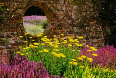
This group of yellow flowers is highlighted against the dull red brick wall. The drift of mauve flowers in the distance contrasts with the dark woods behind and the lighter green field.
BRIGHT WHITE
While purple and green are closely related on the color wheel, adding white creates a stronger composition. As pure white reflects the most light, these pots stand out against the purple wall.
THE PROPERTIES OF COLOR
Warm colors (reds, yellows, and oranges) can make spaces appear smaller and intimate. Cool colors (blues, whites) make areas look larger and more open. Green is a neutral color.
REDS
- Reds and oranges suggest excitement, warmth, passion, energy, and vitality. They stand out against neutral greens, and work best in sunny sites but, if over-used, can be oppressive.
YELLOWS
- Yellows are sunny and cheerful. Most are warm and associate well with reds and oranges. Greenish-yellows are cooler and suit more delicate combinations.
BLUES
- Deep blues can appear very intense, lighter blues more airy. Blues suggest peace, serenity, and coolness. Purples carry some of the characteristics of both reds and blues.
GREENS
- The most common color in the plant kingdom, green comes in many variations, ranging from cool blue-green to warm yellow-green. They suggest calm, fertility, and freshness.
WHITES
- White is common in nature. It is a combination of all other reflected colors, and suggests purity and harmony. White spaces seem spacious; the downside is they can feel stark.
BLACKS/GRAYS
- Blacks and grays are the absence of color, when light rays are absorbed and none are reflected back. Black is glamorous when used sparingly, but depressing when extended over large areas.
LIGHT AND SHADE
Responding to color is a sensory reaction, like smell and taste, and the way in which our eyes read a color is dependent upon the amount, and intensity, of light that is reflected from that color. Sunny areas make colors appear bolder and more concentrated, while shaded areas reflect more muted hues. This means that flat areas of color—for example, a painted wall—may look quite different depending upon their aspect and orientation. Similarly, the hues of flowers and leaves will change depending on their location, the degree of shade cast on them, and the time of day.
COLOR BOOSTING SUNLIGHT
The strong sunlight has a brightening effect on the yellow wall, and on the sizzling intensity of the red flowers in pots and on the hedge in the background.
NATURE’S NEUTRAL COLORS
Beautiful effects can be achieved by combining a variety of soothing grays, blues, and greens with light-catching whites and yellows, which brighten up a shaded area.
TINTS, SHADES, AND TONES
A general guideline to remember is that pure hues or saturated colors are more intense, while colors that have been mixed together are less vibrant. Black and gray are rare in nature, but they do exist in the form of shadows. A tinted color, which has been “diluted” with white, will be lightened and appear more airy and farther away. A shaded color, which has been “diluted” with black, will appear to be nearer. Tones mainly occur when a color is cast into shade. However, the quality of light in a garden, such as on a bright sunny terrace or in a shady border at twilight, will affect the way that colors are perceived.
TINTS
Hue + white = tint. The more white added, the lighter the color. Tints recede, but pure white may advance.
SHADES
Hue + black = shade. Darker shades advance. They are warmer and appear closer than pale tints.
TONES
Hue + gray = tone. Seen mainly in shadows, tones are less intense and appear muted.
Applying color
We tend to be more adventurous with color in the garden than we are in our homes, perhaps because the outdoor environment feels brighter and less confined. The neutral greens of foliage and blues and grays of the sky also have a softening effect on more strident or clashing colors.
VIBRANT COLORS
Strong colors can be used to dramatic effect in the garden: as bright pinpoints that energize more subtle plantings, or surprise pockets of color separated by greenery. In a flower border you can build up from quieter blues and purples to crescendos of fiery reds and oranges. These hot colors will stand out all the more by combining them with a scattering of lime green, dark bronze and purple foliage.
RADIANT HUES
Use glowing flower shades for hot, sunny aspects where the colors will really sizzle in the light.
HOT SEATS
The colors used in this seating area create an upbeat atmosphere—the ideal setting for stimulating lively conversation.
RELAXING COLORS
The muted grays, purples, and blue-greens typical of Mediterranean herb gardens create a restrained atmosphere, perfect for a contemplative retreat. Plantings that pick up the heathery colors of distant hills make a space appear larger. However, a calming palette doesn’t have to be muted; it can also include fresh greens and pastels, which will work well in most settings.
REFRESHMENT
Fresh white, lemon, and green combine with a brighter pink to create an uplifting but essentially restful planting. Perfect for an intimate seating area tucked somewhere away from the house.
COUNTRY CALM
The lavender and purple sage add to the serene color palette of this formal garden with a Lutyensstyle seat.
NEUTRAL COLORS
Earthy browns and sandy tones are reminiscent of harvest time and appear warm and nurturing, contributing to a calm, relaxed atmosphere. Weathered wood elements are perfect for gardens with a country look. In urban locations, you can feel closer to nature by utilizing reclaimed timbers, wicker and bamboo for screens, raised beds, and furniture. For flooring, consider sandstone paving, decking, or a shingle beach effect with pebbles.
MUTED TONES
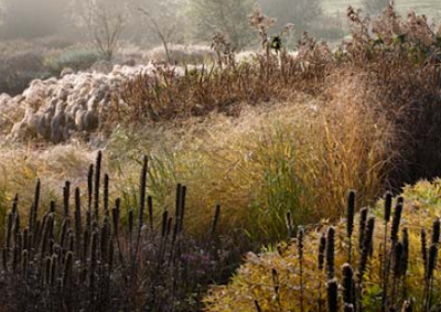
As they die back, perennials and grasses continue to inspire, creating winter interest and a harmonious palette of browns.
RUSTIC SIMPLICITY
Basket-weave stools and a table made from a tree trunk blend seamlessly with a rustic-style garden.
NATURE ROOM
Blocks of wood provide a muted backdrop for birches and the intermingling greens of the grasses and foliage plants.
MONOCHROME COLORS
Hard and soft landscaping in a restrained palette of black, gray, and white, with the addition of green foliage, produce refined, elegant designs. The approach is perfect for elegant period gardens with a formal layout. White blooms and silver foliage also work well with metallics in a chic city courtyard. Use cream or white flowers to enliven shade, and combine with variegated and lime-green leaves.
SPRING WHITES
This elegant design comprises white forgetme-nots, tulips, daisies, and honesty with hostas and silver astelia foliage.
BLACK DIAMONDS
Flanked by crisp green woodruff and a low clipped box hedge, this stylish gray and cream gravel pathway with a black pebble mosaic makes an eye-catching focus for the small front yard of a town house.
ARTIFICIAL COLOR
Colors that are rarely seen in nature tend to be the most attention grabbing. Contemporary designers use Day-Glo colored materials and lighting to give a space a more futuristic or avant-garde look. Examples include furnishing fabrics, Plexiglas screens, and neon-blue LEDs.
DAY-GLO COLOURS
Bold, cartoonish colours, such as bubblegum pink, lime green, orange and turquoise are so vivid they seem to glow. Attention grabbing but use sparingly.









No comments